Kitchen Cabinet Colors: How to Choose One You Won’t Regret
Every color looks good in a showroom. Here’s how to tell which one will still look good in your kitchen, in our light, in five years.
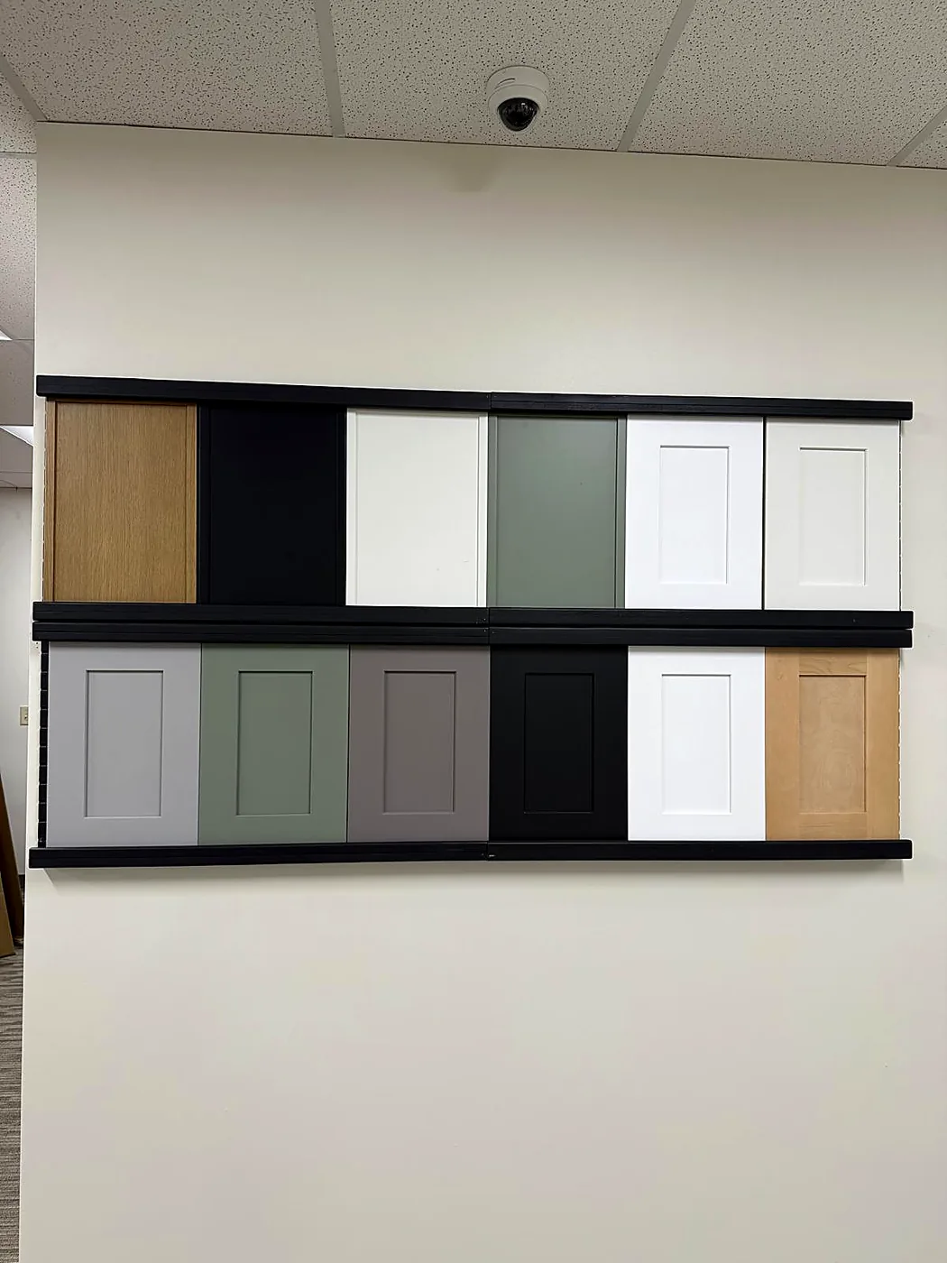
Color is the decision homeowners agonize over longest and test least. Here’s the process we walk people through at our Isom Rd showroom — starting with the two things in your kitchen you are not replacing.
Start with what you’re not replacing
Cabinet color is almost never a blank-slate decision. In most kitchens we do, the floor stays and often the countertop stays too — and both are far larger than your doors. They set the rules.
- The floor is the hard constraint. The tan 18" tile in a lot of 1990s–2000s builds runs warm, so a cool-based door sitting on it makes the floor look dirty rather than intentional. A gray-toned plank does the same in reverse to a creamy white.
- The countertop is second — if you’re keeping it. Granite with strong gold and brown movement settles down beside a muted door and gets louder beside a bright white one.
- If both are going, choose in order: floor, countertop, cabinets. It’s easier to find a slab to suit a door than a door that rescues a slab you already installed.
Our light will change your color twice a day
South- and west-facing kitchens here take hard, warm sun most of the year. Undertone — the faint yellow, blue or green base under the color name — is what it exposes.
- Whites drift cream by mid-afternoon. A white with a yellow base can go frankly buttery; a cleaner white absorbs the shift gracefully.
- Cool grays surprise people most. Bright afternoon sun makes them read blue; a north-facing room leaves the same door flat and faintly lavender. Warm gray and greige hold up better — the whole subject of white vs. gray shaker.
- Bulb temperature moves everything again. A 5000K “daylight” LED is the most common reason a color that looked right at 2 p.m. looks wrong at dinner. 2700K–3000K flatters nearly every cabinet color.
To see an undertone instead of guessing, compare. Hold the door against plain printer paper: next to true white, a warm door shows its yellow and a cool one its blue. Then hold it against your floor. Pick one temperature family and stay in it — mixed undertones are what people mean when a kitchen “feels off.”
What each color shows on a Tuesday
There is no low-maintenance cabinet color — only colors that show different things. Pick which mess you’d rather look at.
- White and off-white: grease near the range, coffee splash, the finger shadow around pulls. It all wipes off. The lasting risk is yellowing beside the cooktop when the finish is cheap.
- Mid-tone gray, greige and muted color: the forgiving band. Hides handprints, dust and daily haze. If you cook often and wipe down rarely, live here.
- Dark satin — navy, charcoal, espresso: excellent on grease, poor on our water. Hard water dries to pale mineral spots that are obvious beside the sink, and dust reads as a film across the run.
- Natural wood grain: the most forgiving surface in the kitchen — the grain breaks up everything that lands on it.
Sheen and door style are part of the color
The same paint at three sheens looks like three colors. Matte hides surface flaws but takes more scrubbing at the trash pull-out. Satin is where most kitchens land — easy to wipe, not glossy enough to throw glare off a west window. High gloss on a sunny wall behaves like a mirror. Our post on cabinet finishes covers how paint, stain and laminate wear.
Door style shifts the read too. A recessed panel — Shaker, Slim Shaker or our Esca collection — casts a shadow line that makes any color look deeper. Raised Panel adds more shadow and leans traditional. Frameless European has almost no relief, so color lands flat and pure, which flatters a confident color and exposes a muddy one.
Resale: how much risk is in the color
If you’re listing within a couple of years, white and warm neutrals remove a variable — they’re what buyers expect and they photograph bright in listing shots. If the house is a keeper, that argument mostly evaporates. The middle path is to put the opinionated color where it’s cheap to change later: the logic behind two-tone kitchens, and part of why navy outlasted the other bold colors of the last decade.
How to test a color before you order
- Take home real door samples, not paint chips. A chip and a finished door in the same color are not the same color.
- Take two or three, never one. Alone, every color looks fine. Side by side, one wins.
- Look at them vertically. A sample lying flat on the counter catches light no hanging door ever will. Tape it to the cabinet face at eye level.
- Stand them against the floor and countertop you’re keeping — never bare drywall.
- Check three times a day: morning, mid-afternoon when the west sun is hardest, and at night under your own bulbs.
- Live with them a week. Most people quietly change their mind on day three or four — and it costs nothing then.
Your next step
Come by the showroom at 431 Isom Rd and take doors home — no charge, no deposit, and our team is bilingual. Once you’ve narrowed it to two, we’ll put your layout into a 3D rendering in about 48 hours. Browse all 36 styles or request a free quote.
Free design + 3D rendering + in-home measurement on every project. Affirm financing available.
Get a Free Quote (726) 300-8438