Two-Tone Kitchen Cabinets: Light Top + Dark Island (San Antonio Design Guide)
Two-tone kitchens are timeless. Here's how to pair upper + lower cabinet colors, what works for our hot Texas light.
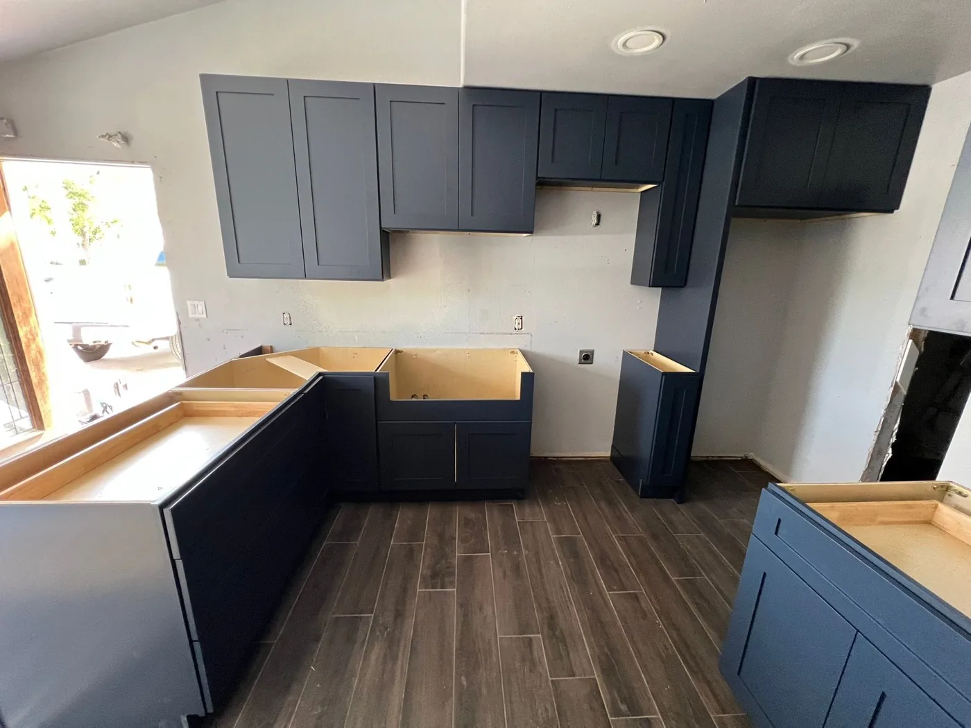
Two-tone kitchens have come back with a vengeance in San Antonio over the past 3 years. Here's how to make it look intentional, not random.
What we install most in San Antonio
From the steady stream of jobs through our San Antonio showroom, certain styles dominate every season. Knowing what other homeowners are picking — and why — helps you make a confident choice instead of agonizing over Pinterest boards. The big patterns: white and gray shaker remain perennial favorites. Painted statement colors (navy, sage green, espresso) appear in about 1 in 4 kitchens we touch. Modern slab and Galaxy series are growing fastest in new construction.
Quality signals to look for
Regardless of style, the construction underneath matters more than the door front. Look for: ½" or ¾" plywood box construction (not particleboard), solid wood door frames (not MDF), dovetail drawer boxes (not stapled), full-extension soft-close glides, conversion-varnish or UV-cured finish, and full-overlay or inset door fit. Every cabinet we sell at WoodArt meets all of these criteria.
Pricing in San Antonio (2026)
For a typical 10×10 kitchen (the industry-standard sizing benchmark — about 12 linear feet of cabinets):
- Budget shaker / stock plywood: $3,500–$6,500
- Premium shaker / painted: $6,500–$11,000
- Custom + inset / luxury: $11,000–$25,000+
These are cabinet-only prices. Add countertops ($2,500–$8,000 for 50 sq ft), installation ($1,500–$3,500), demo ($800–$2,000), and floor work ($1,000–$5,000) for a complete picture.
Mistakes we see homeowners make
- Picking finish before testing color in your kitchen light. San Antonio's south light is intense and warm. A "cool gray" online may read green in your kitchen. Always get a door sample.
- Skipping the in-home measurement. Online cabinet ordering is fine — until you discover your walls aren't square.
- Forgetting the soft-close upgrade. A $200 soft-close hardware upgrade across your kitchen will be the thing you notice every day.
- Under-budgeting for trim and fillers. The pretty doors are 80% of the cost; moldings, fillers, toe kicks, and panels are the other 20% — and they're not optional.
What we'd recommend you do next
If you're 6+ months out: keep gathering inspiration. If you're 3 months out: come to our showroom, take home door samples, live with them under your kitchen light for a week. If you're ready: request a free quote or book a free in-home measurement. We'll get you accurate cabinet pricing within 48 hours.
Free design + 3D rendering + in-home measurement on every project. Affirm financing available.
Get a Free Quote (726) 300-8438